A small multiples of scatter plots, part II
Reproduction in 200 species of mammals
In my previous small multiples, I used socio-economic variables of 100 countries to draw a matrix of scatter plots. But, having taught biology for so many years, I wanted to do a similar visualization using biological data instead. Thus, in this scatter plot matrix, I used 8 variables (4 of them related to reproductive system) of 200 species of mammals, from 16 different orders.
Click to hide/show:
How to read this visualization
This small multiples of scatter plots has the data of 200 species of mammals regarding 8 variables: Adult body mass (in grams), Gestation length (in days), Litter size, Maximum longevity (in months), Population density (in number of individuals per square Km), Sexual maturity age (in days), Social group size and Weaning age (in days).
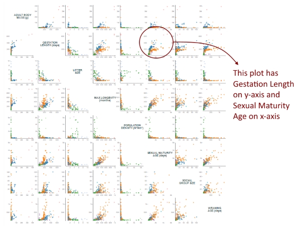
Each “cell” is a scatter plot with 2 variables (one in the x-axis and the other in the y-axis). This gives us 64 scatter plots, but I replaced those 8 where the x and y-axis variables were the same with the name of the variable. This allows you to easily recognize the variable on each axis. Let's take the variable “Litter size”, for instance:
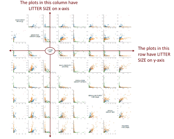
Given a variable, all the plots it its row have that variable on y-axis, and all the plots in its column have that variable on x-axis. Therefore, it’s easy to determine the x and y variable of each plot:
You can hover over each circle to see the binomial name and the Order of the species represented in that circle and its two variables for that particular plot. The color of each circle indicates the Order of that species. Click on the boxes on top to show or hide a particular Order.
How I made this visualization
The code in this visualization is almost the same of the previous version using socio-economic variables. As I wrote in that version’s page, in most of examples found on the web, small multiples are made appending several SVGs to the page, each one containing one chart. In a past “small multiples” visualization, I tried a different approach, building only one SVG and creating several <g> elements, appending the drawings inside each <g>. But, for this visualization, I decided to create just one SVG without any group element! So, how to do it?
It’s quite simple. First, knowing that I’d have a 8x8 matrix, I create some “cells” using D3 scales:
var xGrid = d3.scale.ordinal()
				.rangeBands([ outerPadding[3], w - outerPadding[1]])
				.domain(d3.range(0, criteria.length));

var yGrid = d3.scale.ordinal()
				.rangeBands([ outerPadding[0], h - outerPadding[2]])
				.domain(d3.range(0, criteria.length));
Then, it was simply a matter of creating two loops, an outer loop for the rows and an inner loop for the columns:
var criteria = ["adultBodyMass", "gestationLength", "litterSize", "maxLongevity",
				"populationDensity", "sexualMaturityAge", "socialGroupSize", "weaningAge"];

for (var i = 0; i < criteria.length; i++){
	for (var j = 0; j < criteria.length; j++){
		draw(criteria[j], criteria[i], j, i);
	}
}

function draw(xVariable, yVariable, xCell, yCell){
	//draws each plot
}
And positioning each plot according to xCell and yCell:
var xScale = d3.scale.linear()
				.range([xGrid.range()[xCell] + innerPadding[3], xGrid.range()[xCell]
					+ xGrid.rangeBand() - innerPadding[1]])
				.domain([0, d3.max(data, function(d){
					return +d[xVariable] * 1.1;
				})]);

var yScale = d3.scale.linear()
				.range([ yGrid.range()[yCell]
					+ yGrid.rangeBand() - innerPadding[0], yGrid.range()[yCell]
					+ innerPadding[2]])
				.domain([0, d3.max(data, function(d){
					return +d[yVariable] * 1.1;
				})]);
In my previous matrix of scatter plots, the checkboxes only changed the opacity of the circles. But, for this visualization, I decided that unchecking a given Order remove all its species. This is important because it changes the range of the axes, and allow us to focus on the specific data of the remaining species. For changing the data, a new array is created based on the clicked checkboxes:
var newData = [];

for (var i = 0; i < checkedBoxes.length; i++){
	var newArray = data.filter(function(d){
		return d.order == checkedBoxes[i];
	});
	Array.prototype.push.apply(newData, newArray);
}
I think that using just one SVG and no <g> inside it is a simple and effective approach.
I thank my friend, Dr. Fernandes-Ferreira, for kindly sending the data.